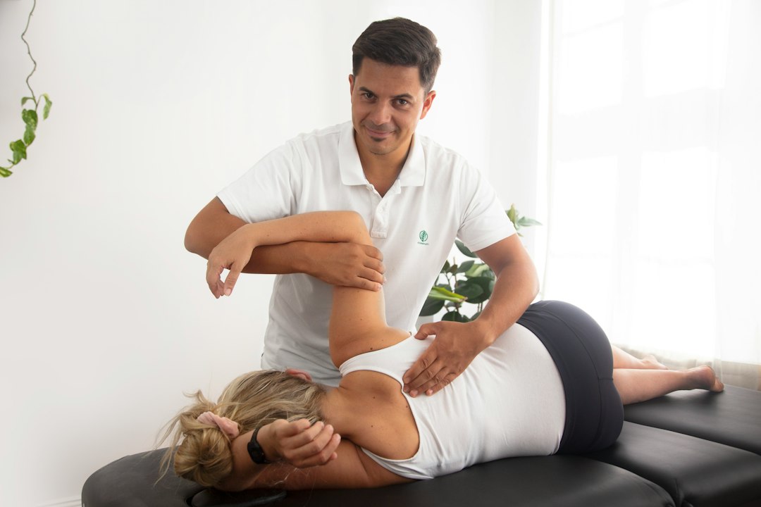

The site’s structure should reflect the clinic’s actual caseload. A sports injury practice might give priority to rehabilitation, return-to-play care, running assessments, and exercise programs. A family clinic may need clearer information about children, older adults, post-surgical care, and referral requirements. Each service page can answer practical questions about appointment length, accessibility, parking, fees, clothing, and what to bring. These details reduce uncertainty without implying a guaranteed result. Reviewing examples of physio website design can help a practice assess page structures, although the final arrangement should suit its patients and reception workflow.
A conversion is any useful next step, not just a completed online booking. It might be a phone call, an appointment request, an email, or a visit to a directions page. A page should present one main action beside the information that supports it. For example, a back pain page could explain the first appointment, identify relevant clinicians, and place a booking link and phone number nearby. Several competing buttons can make the next step less clear. Analytics can record page views, phone link taps, form submissions, and booking completions. Those records show what people do, but they do not explain every reason a visitor leaves.
Phone usability deserves testing rather than assumption. Responsive design allows text, navigation, forms, and buttons to adjust to different screen sizes without forcing sideways scrolling. A patient may be standing at a bus stop, using an older handset, or relying on a weak mobile connection. Large hero images, video backgrounds, and unnecessary scripts can delay the first useful content. Compressing images, removing unused features, and selecting suitable hosting can improve loading while retaining important information. Forms should have short, clearly labelled fields and should not ask for clinical history that reception does not need before making an appointment.
Local search content helps search engines associate a clinic with its services and location. The practice name, address, phone number, opening hours, and service descriptions should remain consistent across the website and relevant business listings. Location pages can mention suburbs served, nearby landmarks, public transport, parking arrangements, and whether the clinic is inside a shared medical building. Repeating a suburb unnaturally throughout a page can make the copy harder to read. Structured data may help search engines interpret an address or opening hours, but it does not guarantee a particular ranking or search result. Someone should check these details against the clinic’s current reception document before publication.
Patients also need enough information to judge whether a practice is suitable. Clinician profiles can explain qualifications, registration details, areas of interest, and treatment methods in plain language. A profile should not imply expertise beyond the person’s training or suggest that a particular outcome is assured. Testimonials and reviews need careful handling because health claims can create misleading expectations and may be subject to professional advertising rules. Accessibility is part of clear communication. Sufficient contrast, descriptive links, keyboard-friendly controls, captions where appropriate, and useful form labels help people with different abilities use the site, while not serving as a guarantee of legal compliance.
A content management system, or CMS, allows authorised staff to update clinician profiles, opening hours, service pages, and announcements without rebuilding the site. That flexibility needs a basic editorial process. The clinic can nominate who approves changes, keep a record of the current phone and address details, and schedule periodic checks for old links or outdated fees. A small habit prevents rework: save the approved wording for opening hours and cancellation information in one shared document before editing several pages. Staff should also know which changes require a developer, particularly edits affecting forms, tracking, menus, or technical settings.
Before launch, test the site on common phones, tablets, and desktop browsers, then submit a real sample form and confirm where the message arrives. Check that map links open the correct entrance, phone links use the right number, and appointment requests do not omit a preferred contact method. Ask someone unfamiliar with the practice to find the clinic address and an appointment option without assistance. Their hesitation often exposes unclear labels that the internal team has stopped noticing. Practical clinic website workflow planning treats these checks as part of reception operations, including who responds to enquiries and how promptly staff update a changed opening hour.